If you run an online store, you?re always trying to boost your sales.?Here?s how to increase the conversion rate of your ecommerce site.
What?s the conversion rate I can be happy with?
Don?t worry about ?average? rates.?A good conversion rate to strive for is better than the one you have right now.
There are just too many variables that affect conversions, so its very difficult to have apples to apples comparisons between different sites. Quality of the traffic is a major contributor.
Rates around 1% and 2% are fairly common.
Quality Product images
If I?d have to pick one single thing that would sell a product online, it?s images.
You *technically could* have an ecommerce site with just images, and no product descriptions (I don?t recommend it). It wouldn?t work vice?versa.
People want to see what they?re getting. The grandfather of boosting ecommerce conversion rates is having high quality photos of your product. The more the better. Show the products from different angles, in context, make them zoomable.
Ties.com gets it right:

Extra credit for the ?view this in the dressing room? feature. Check it out.
Read all about using images for boosting the conversion rate on my other post here.
Great product copy
Product descriptions matter. The role of product copy is to give buyers enough information, so they could?convince themselves?this is the right product for them. Clarity trumps persuasion. The best sales copy is full, complete information. No hype needed.
How long? You should offer both, the?concise?version and the long version. The shorter version should capture the essence: who?s the product for, what will it do and why is that good.
The longer version should give so much information that the user will not have a single question left. If they read the whole thing and still have questions or doubts, then you have a problem. If they?re convinced only half way through, they can just skip and continue to checkout.
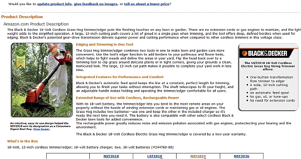
Let?s look at the same product on Home Depot and Amazon.?Home Depot version?sucks:
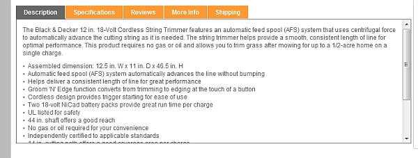
They cram the text inside a stupid iframe, only provide you with 3 sentences of information and a bunch of technical info in bullet points.
Amazon version?has proper text for humans, turns features into benefits and even provides a comparison table. Technical info is provided too.
If you sell stuff you don?t make, don?t just repeat the manufacturer?s canned descriptions. Add your personal touch and recommendations ? tell the customer why you personally recommend this product and how it will help them.
Recommended reading:?E-Commerce Copywriting: The Guide to Selling More
Product videos
Images are good, but everything indicates that video is the future. Photos have their limitations, video is the next step before actual touching and feeling.
If you?re not doing product videos yet, do them for at least part of the inventory and see if it makes a difference.
Zappos has videos for almost all of their product,?such as this:
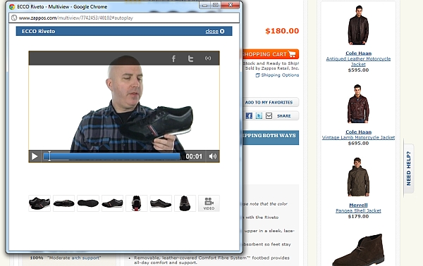
Read my post on how using video increases conversions.
Customization creates ownership
People like to customize stuff. It?s fun, has a game-like element to it and creates a feeling of ownership. Once you?ve spent minutes configuring a product, it feels like your own.
Back in 2008 I needed a new laptop and went to dell.com. I played around for like 30 minutes customizing my laptop. At the end, of course I bought it. It ended up being much more expensive than any of their standard sets.
If your business is up for it, you can?mass customization, like Dell or Timbuk2 ? using efficient manufacturing (the labor contents of every Trimbuk2 bag is only 30 minutes).
Here what?Timbuk2 bag customization looks like:
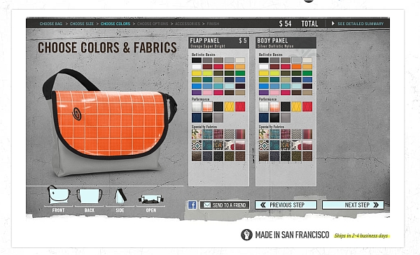
Does customization make money? Gemvara lets women customize jewelry (?I designed it myself!?), and they?re making millions. So yeah.
Charging for shipping is a conversion killer
Do you know how many merchants offer free shipping? Half of them! Some offer always free, some have conditions. Amazon and JCPenney offer free shipping if you buy for at least $25 or $50 respectively. Nordstrom offers?free shipping for all purchases. All of this has gotten people used to the idea of free shipping.
An E-tailing Group study revealed that unconditional free shipping is #1 criteria for making a purchase (73% listed it as ?critical?). In another study?93% of respondents indicated that free shipping on orders would encourage them to purchase more products.
High shipping costs were rated as the number one reason why consumers were not satisfied with their online shopping experience. In fact, shipping costs are the main reason why people prefer brick and mortar to online.
People want free shipping, no surprise there. But how attractive is it? In fact, orders with free shipping?average around 30% higher in value?those that charge a few bucks for transport. Makes business sense.
When 2BigFeet introduced free shipping for orders over $100, their conversions went up 50%.
For whatever reason, a free shipping offer that saves a customer $6.99 is more appealing to many than a discount that cuts the purchase price by $10.
David Bell, Wharton
If you?re afraid that offering free shipping will erode most of the profit in the order, watch this video for a useful strategy to use.
What about charging very little instead of free?
In the book ?Free?, the author Chris Anderson shares the case of Amazon. Once Amazon implemented the free shipping offer, sales went up in each country except for one ? France. Why? France charged 20 cents instead of free. While 20 cents IS almost free, it sure didn?t seem that way to people. Once they changed it to free, sales went up also in France.
Moral of the story: free is in a league of it?s own. The difference between cheap and free is huge.
If you charge for shipping
If you decide to still charge for shipping, you have to do this one thing: mention shipping costs up front. If you can, charge a flat fee (simple pricing is best) instead of per item.
Nothing kills conversions like a surprise shipping fee revealed at the very end.?According to this study 47% of people indicated they would abandon a purchase if they got to checkout and found that free shipping was not included.
Have a section for sales and specials
The above mentioned?E-tailing Group?study conducted at the end of 2011 found that 47% of online buyers would only buy discounted products, except under exceptional circumstances. 62% said they are looking for a?section that identifies sales and specials.
Endless sales, Groupon and its clones have trained people to shop cheap. Discount seeking behavior is set to continue, so thinking about having a dedicated ?sales? section on your site. Naturally do what?s right for your brand, but it might be something worth experimenting with.
Suggestion: make it clear where people can see stuff on sale.
Steve Madden has several calls to action for stuff on sale:
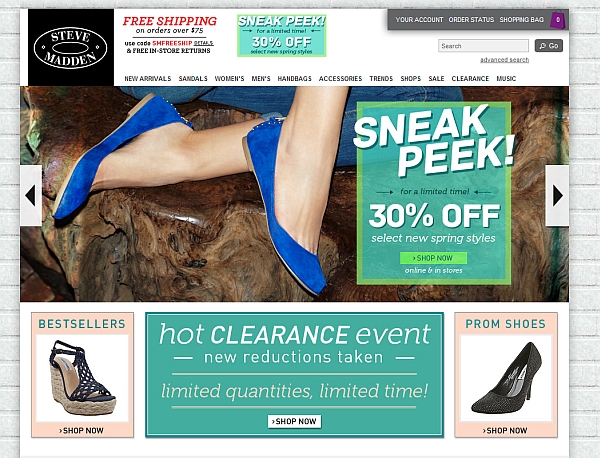
While the rotating offers banner is usually?not a good idea, they have the exact same offer on each banner ? so it works out.
6pm has a central location for its ?stuff of sale? notice. Pretty easy to spot:

Tackle shopping cart?abandonment
Shopping cart abandonment means the loss of a customer who is going through the check-out process of an online store. It?s widespread.
In 2011, the shopping cart abandonment rate?reached all-time high?of 72%. It?s believed to continue climbing.
A?Forrester study?found that 89% of consumers had abandoned a shopping cart at least once. Researchers attributed that high rate to user sophistication: as shoppers become more experienced online, they are more likely to comparison shop even as they move toward checkout.
Other industry experts offer this explanation: shoppers are shocked at high shipping costs.
Top reasons why people abandon shopping carts (and what to do about it)
- High price.?If your product is the same or similar to what the competitors offer, people will choose based on the price. If your price is the best, say it (must be true, or lose all credibility). If it?s not the best, you have to communicate your added value.
- You charge for shipping? Stop. Figure out how to offer free shipping.
- Hassle: you ask for too much data / forced registration.
- Doubt: will it fit me? Can I return it??Use live chat to address buyers? concerns and answer their questions.
- Your site is too slow. Speed up your site.
Follow up
A very effective way to reduce shopping cart abandonment rates is following up by email?(263% improvement in the linked test). Another company?got 500% ROI with shopping cart abandonment campaign. SmileyCookie recaptured?even 29% of the abandoned carts.
How many companies do this??Listrak shopped?Top 1000 retailer sites, added items to a shopping cart, began the checkout process by adding first & last name, e-mail address and phone number, and then abandoned the carts before completing a purchase. They then tracked whether retailers responded with e-mails and analyzed the contents of any follow-up e-mails retailers sent.
Only 14.6% of the top web retailers used e-mail campaigns as a way to retarget shoppers.
So what do you do?
Many ecommerce platforms such as Magento, 3DCart, and Volusion offer integrated cart abandonment solutions.?There are also several add-on software providers out there that can do this. Here are 2 to start with:
Persistent shopping cart
People comparison shop. A common behavior is that they add products to cart on a site, so they could return later. If upon their return they discover that the contents of the shopping cart have expired, they will not start from scratch (too much hassle).
The solution: persistent shopping cart. Done with persistent cookie, this shopping cart will be right there even a day or a week later.
Save the cart
An alternative to this is the option to save the shopping cart contents, so the user can retrieve it later after they?re done with comparison shopping.
Giving the option to send the cart contents to email (later retrievable through a link) is a smart way of staying on the shopper?s mind.
Show contact info, offer live chat
It?s a small thing, but known to boost conversions ? especially important for small, less known stores. It?s a trust thing -?making your email and phone number clearly visible shows you?re a real business.
Icon Direct shows a real person and a prominent phone number:
![]()
Offer live chat option for answering quick questions.?77% of e-retailers that use live chat considered it a critical communication method, suggests results of a survey.
Apple is doing it:

?
A live chat service I?ve used myself and can strongly recommend is Olark.
Clear progress indicators
People like to be in control and to be in the know. Are we there yet? We want to know how much longer something is going to take. This is why numbered lists are better than unordered lists and why you should have clear progress indicators on your site.
Crutchfield has it in the top right corner, but I think it?s too small and will go unnoticed by many:
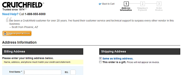
?
The way Crate&Barrel is doing it is better, the steps are more prominent:

?
Address uncertainty
Is this safe? Can I do returns? When will I get my stuff?
If the visitor has never ordered from you, he will have several uncertainties you have to deal with. Make a list of the most common objections and doubts, and address them on product pages and in the shopping cart.
Asos has a tabbed box detailing shipping and returns info right on the product page:
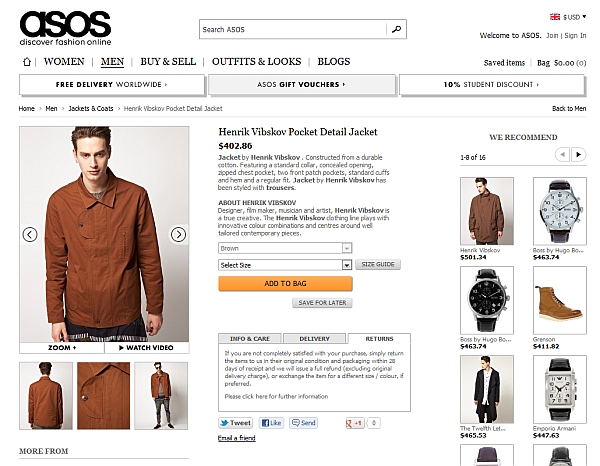
?
Ace Hardware puts their phone number, privacy policy, security guarantee and returns info on their shopping cart page.
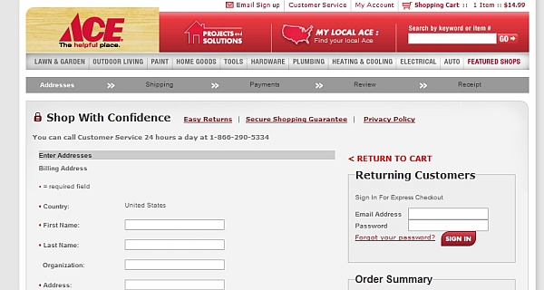
?
I like how Groupon is dealing with this (look at the sidebar):
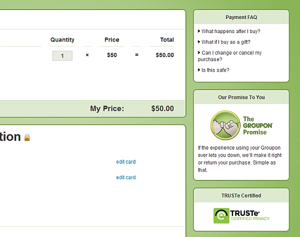
Offer multiple payment options
Options are good. 2 reasons:
- Given the scandals about credit card information theft, some people are vary of using credit cards for online payments (especially on a site they?ve never used before).
- A 2009 survey of 2000 online British adults found that 50% of those who regularly shop online said that if their preferred payment method is not available, they will cancel the purchase.
These people are not the majority, but adding payment options like PayPal or Amazon Payments to credit card payments?will help you win over some customers you would lose otherwise.
Here?s how Altrec offers 2 options:

Communicate your value proposition
Too many ecommerce sites forget about value propositions. When new people arrive on your site, they have to figure out what your site is about in a matter of seconds. Yes, they can see that you sell stuff, but how are you better or different?
For instance, I?ve never heard of this store:

They don?t say ANYTHING interesting about themselves. This is costing them sales.
Here?s a different example. While it?s far from perfect, they state what they do under the logo and list key reasons for buying from them:
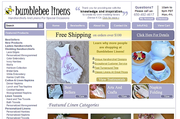
?
If you don?t communicate your value proposition, you will lose a lot of potential buyers. People won?t invest time to figure it out.
Read this:?Useful Value Proposition Examples (and How to Create a Good One)
Better search
Search is crucial to e-commerce. People need to find products, and quick. Around half of the visitors navigate ecommerce sites using search. For search-centric sites like Amazon, the number is probably way higher.
Use auto-suggest search that shows products as you type. After online retailer?BrickHouse Security?added an automated drop-down menu of textual results that appear when shoppers enter terms into its site search window,?it boosted conversion rates.
Wild Gems example:
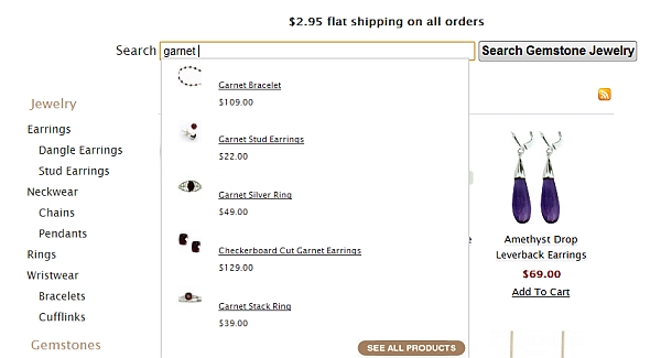
?
There?s a really good article on e-commerce search on Smashing Magazine, read it.
More choice requires better filters
The more choice you give people, the harder it is to choose something. The way to combat paradox of choice is by filters. The more choice you offer, the better filters you need to provide.
Ever been to a wine store? It?s one of those places where the selection knocks you unconscious and you feel like grabbing beer instead. Retail stores don?t have good filters (usually it?s the salesperson).
Online, you can have great filters. The role of the filter is to make finding most suitable products easy.
Winelibrary?s filters do a good job:
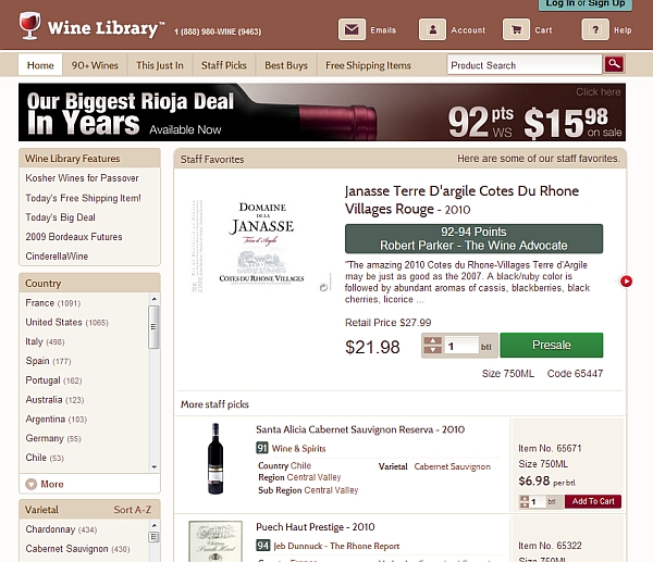
All of the filters don?t fit on this screenshot, there are more. The order of the filters is by popularity: more common options like country and variety first, bottle size and closure at the bottom as they don?t matter to most.
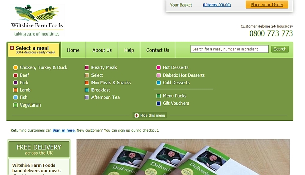
Wiltshire Farm Foods have filters right on the home page, starting with?the top selling categories which account for the vast majority of sales:
Short forms
Eventually, people will some stuff to the cart and they?re ready to check out. Your success in leading them through this depends a lot on the forms. The more fields they have to fill in, the more friction there is.
This is the very reason people prefer to buy from Amazon. Their shipping and credit card information is already there, so they will save themselves from the hassle of filling in forms. They?re even ready to pay a higher price just to save a couple of minutes (I know I am!).
I?ve seen stores ask for shipping address for digital downloads. Ugh! No fax, no salutation. Just stick with the essentials.
A must-have feature: people need to be able to check the box ?shipping address same as the billing address?:
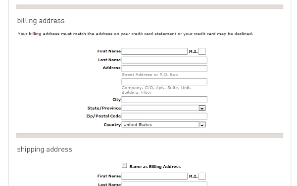
Bottom line: do not ask for information you don?t absolutely need.
Decode the credit card data
People from all walks of life shop online, and some are not very savvy.?Some people don?t know what the CVV code is, some are even having a hard time figuring out their credit card number.
Your job is to make it as clear as possible what data you?re asking for. For instance Target is making it difficult:
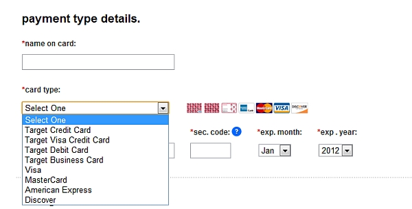
Why on earth would you ask the type of a credit card! I bet tons of people are spending minutes figuring out what card they have, and another group constantly chooses the wrong card type.?This is very bad design. Your job is to make the customers? life easy, not yours.
Another thing: sec. code. That?s not clear and easy to understand.?Yes, there?s a question mark there, but it could be done so much better.
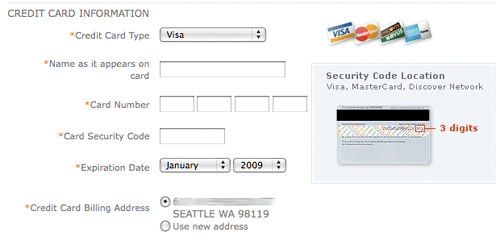
This also ask for card type (#fail), but at least explains where to find the 3 digits.
?
Promote shopping cart contents
Many marketers assume that once the customers click ?add to cart?, they will make it through the entire checkout process. Nope. You?ve still got work to do.
Even when they add a product to the shopping cart, it doesn?t mean they?re going to buy it. You have to keep selling it to them.
The best solution is perpetual shopping cart ? displaying the contents of their cart at all times while they browse.
Onlineshoes.com has it in the right sidebar:
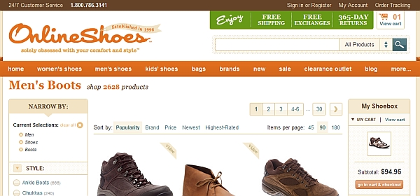
The key is to show the subtotal, items in the cart and photos: a constant reminder what they?re about to buy.
Best Buy only shows ?2 items?. People will forget in 2 minutes what they added and how much that was.

Marketing Sherpa reported?that 64% of retailers believe perpetual shopping carts are ?very effective? at improving conversions.
Account registration in the background
Surely you know the $300 million dollar button story. Don?t force people to register.
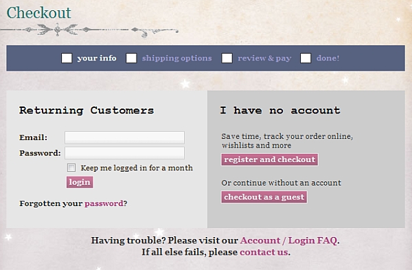
Instead, offer the option to register if they want, but create an account anyway for those who opt for guest checkout. They will enter their email and name anyway. You just have to generate a password and email it to them once they complete their order.
Sock Dreams plays nice and offers guest checkout:
Product reviews
People use reviews, a lot. Even while they?re?shopping in brick and mortar stores they read online reviews. Probably you?re doing it too. I know I am.
Nearly 60 percent of online shoppers consult reviews prior to purchasing consumer electronics and 40 percent of online shoppers claimed that they would not even buy electronics without seeking reviews about the product online first.
Bottom line:?Start gathering and showcasing reviews on your site.
If you sell commodity products and can?t get users to write many reviews, you might want to look into pulling reviews from an external site to have more of them.
Don?t delete negative reviews -?they actually help sales?if there are only a few of them.
Upsell, but watch where
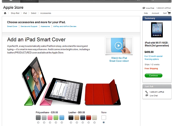
Upselling and cross-selling will boost your average order size. Apple knows this and immediately after adding an iPad to your cart, it tries to upsell you:
?
The rule of upselling is this: you only offer related products (Apple offers smart cover for iPad, and doesn?t try to sell you an iPod), and the offer must be at least 60% cheaper than the product they just added to their shopping cart.
So if they?re buying pants, upsell a belt.
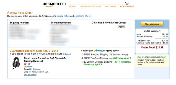
Brick and mortar supermarkets will try to upsell you while you?re checking out (grab a candy bar while you wait). Online, don?t do it. Focus on getting them to check out.
Amazon gets it and never tries to upsell you during checkout. Placing the order is just one click away, now is not the time to distract me:
Clear, big calls to action
The user experience in your store needs to be smooth. Smooth in the sense that they should never have to look for something. It should always be obvious how things work.
If people need to look for ?add to cart? or ?checkout? buttons, you?re failing miserably. Those two are the most important buttons in your store. You want them big, bold and prominent. Avoid text links.
Patagonia?s ?add to cart? button stands clearly out from the rest:
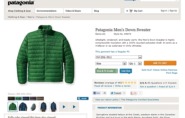
The wording and color of the button also matter, but you need to test it. Bigger buttons are better.
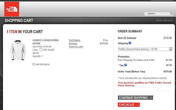
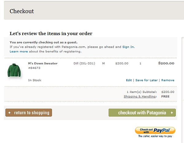
The North Face has buttons that stand out in the checkout screen, but I think they?re creating some confusion there. You must have hierarchy. The checkout button is more important than the ?continue shopping? button, hence I?d make it bigger and make it first.
Here?s how Patagonia has solved this. This is better.
Offer back-ordering
Item out of stock? Too bad, no sale. Or still?
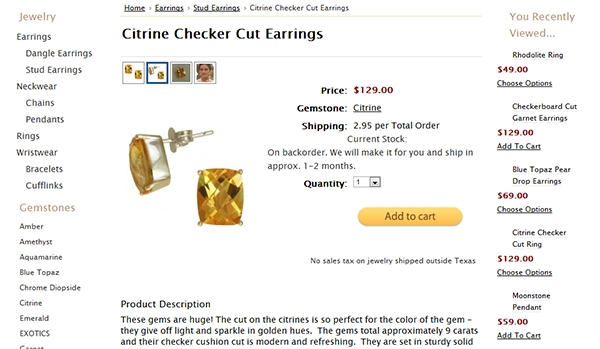
If you plan to re-stock the item within a predictable time or can have it custom made/ordered, offer a backorder option.
Wild Gems does this successfully:
Don?t copy Amazon (or other big brands)
What is permitted to Jupiter is not permitted to an ox.
The big guys have a huge advantage over you ? they?re known. They don?t have to wrestle with trust and security issues like most small online stores. People are super confident that Amazon or Target will deliver the goods (and on time), have stuff in stock, accept returns and what not.
You still need to win customers? trust. Don?t copy the big guys blindly. (10 more reasons why not).
Do user testing
Usability is your best friend. I strongly recommend you conduct user testing on your ecommerce site to find problems with your interface you might not be aware of. Give people some tasks (e.g. find X, and buy it), and have them comment out loud while they?re browsing your site. You either watch over their shoulder or watch the screen recording of it.
15 people will already discover 99% of the problems. Even?testing one target user is better than testing none at all.
Usertesting.com and YouEye are some of the tools you can use for it.
Test this stuff
Take my advice. Then do your own testing.
Related posts:
miss america lana del rey saturday night live focus on the family packers vs giants giants score aaron rodgers 2012 golden globe nominations
No comments:
Post a Comment
Note: Only a member of this blog may post a comment.